
10 Unusual Punctuation Marks
Celebrating National Punctuation Day

Punctuation is an essential part of grammar and syntax, allowing thoughts to expressed clearly and with intent. Some of the oldest known punctuation marks ever discovered date back to the 800s BCE in a variant of Phoenician. The Greeks invented the concept of separating sentences or complete thoughts with punctuation, and while punctuation fell largely out of favor with the Romans, it made a major return in the medieval area, especially as printing took off. It was largely during the medieval period that punctuation was developed, both in Asia and in Europe, with manual typography, typewriters, and electronic communication changing what types of punctuation were commonly used or adapted.
Different languages have their own punctuation marks with even American English and British English using some punctuation in different ways. Some marks indicate how words, letters, or sounds are pronounced while others indicate the type of thought being expressed. Some languages also have different rules or spacing of punctuation marks between words. Over the years, some punctuation has been adopted into English and others have fallen out of fashion. To communicate the complexity of human thoughts and give written communication the social or vocal cues it lacks, there have been several punctuation marks proposed over the years. Here are 10 such unusual and uncommon punctuation marks to learn for National Punctuation Day.

The term asterism is perhaps better known in astrology where it refers to an observed pattern of stars in the sky, such as the constellations. In punctuation and typography, however, this mark is three asterisks (*) placed in a triangle pattern. The mark has been used in publication and punctuation for several purposes, but the most popular is as a dinkus. The term dinkus is any typographical device used to denote an intentional omission, logical break, or division between sections or ideas. While the asterism was used for this purpose historically, since the 1850s three asterisks in a row (***) or three bullet points in a row (• • • ) have been more commonly used for this purpose. Today, the dinkus is more used for ornamentation to indicate breaks between sections or subsections in a work.
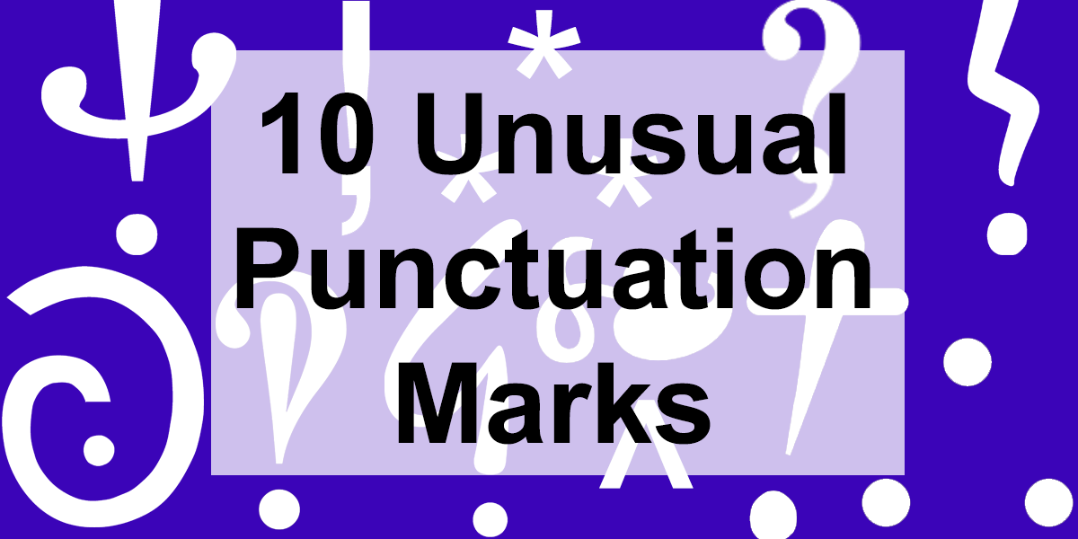
In 1966, French writer Hervé Bazin put forward several new suggestions for both the French alphabet and punctuation marks in an essay Plumons l’Oiseau ("Let's pluck the bird") that he thought were more in line with the expression of thought and concepts in the French language. Among his six new "points d’intonation" or punctuation marks were the authority and certitude or “conviction” marks. The two marks are very similar and also have very similar purposes. The authority point was to be used by authors to indicate they had the expertise and authority to put forth a claim and that their claims should be taken seriously. A certitude point is to indicate a writer is very confident in what they are writing but do not necessarily have the personal or research expertise to back it up. He felt that this was preferable to writing in all caps for emphasis. While Bazin himself never used any of his newly invented marks outside of this essay, they have provided a source of mirth and debate for punctuation lovers ever since.
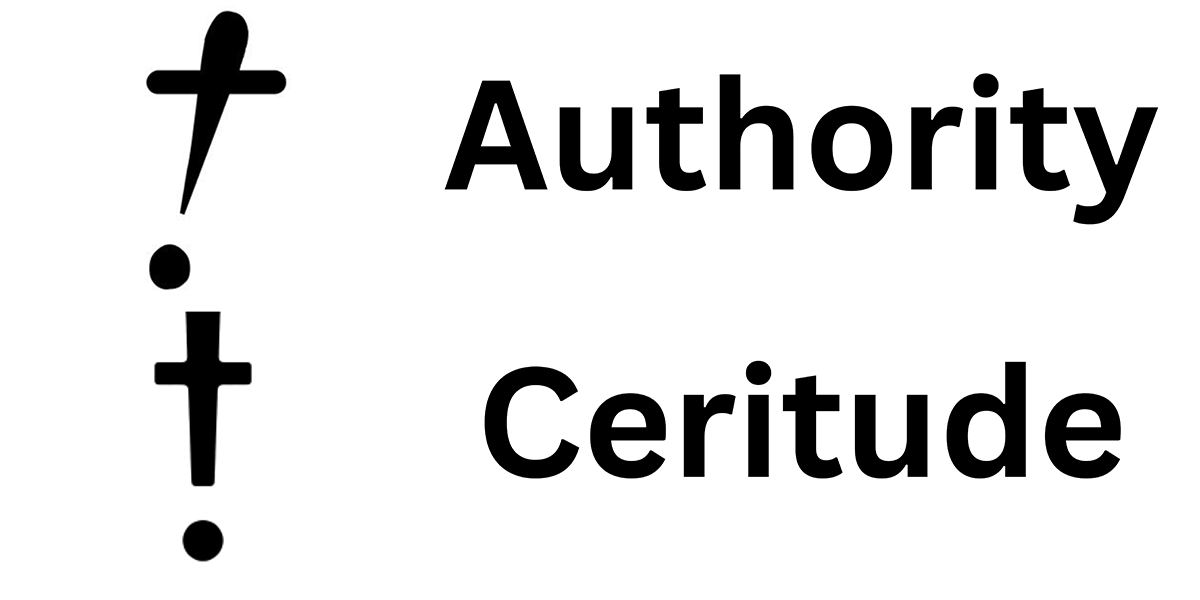
Taken from mathematics, the because or therefore sign is very similar to the asterism save it is three bullet points arranged in a triangle rather than three asterisks. This symbol is rarely used outside of math and logic textbooks or shorthand where it is still employed to mean “before.” The mark was allegedly invented by Swiss mathematician Johann Rahn in his 1659 algebra text but had switched to an inverted version by the 1668 version in English. The mark was rather common among authors in the 1700s to indicate “because” or “therefore,” especially in publications where the more letters were printed the most expensive things were to print. By the 1800s, this punctuation mark had fallen largely out of favor in Europe and its use became very rare.
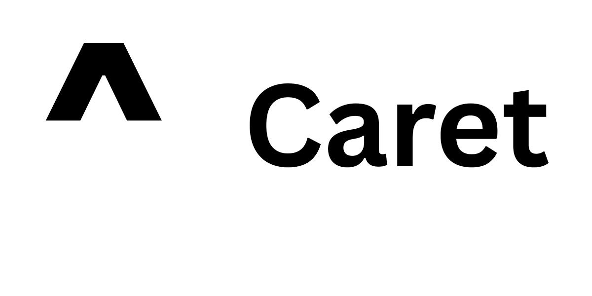
One of the punctuation marks on this list you may still actually find on your computer keyboard, the caret (^) is still commonly used in proofreading and typography to indicate material needs to be inserted at a certain point at the text. When placed over a letter or character to modify it, the claret is known as a circumflex. The term caret literally means "it lacks” in Latin from the word career meaning “to lack, to be separated from, to be free from.” Anyone who has had an editor suggestion inserting a punctuation mark like a comma, apostrophe, or quotes is probably familiar with the caret. Found usually by stroking SHIFT + 6 on the keyboard, the caret was originally designed to help make accent marks or use as a symbol for superscript and exponentiation on typewriters that did not have such symbols. Because of its use in programming languages, the claret has remained on keyboards and has even been adopted into internet forums and social networking sites as a symbol to underscore or show approval of a previous post.
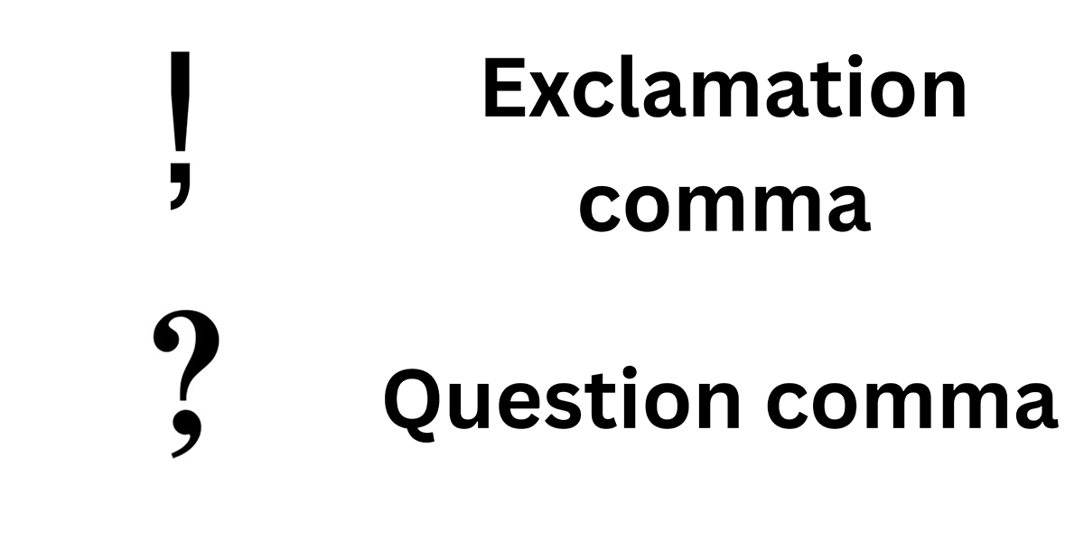
In 1992, Leonard Storch, Ernst van Haagen, and Sigmund Silber filed a patent application with the World Intellectual Property Organization (WIPO) to trademark two new punctuation marks: the exclamation comma and the question comma. Both substituted the dot at the bottom of the traditional mark with a comma and were intended to be used in the middle of sentences, not unlike a semicolon. The intention was for these marks to break up phrases or clauses only one of which required asking of a question or an exclamation. The creators believed these marks would help express that something was surprising or inspired curiosity without stopping the sentence completely. The only country where any movement was made on this patent was Canada, but the national phase of the patent lapsed there in 1995.
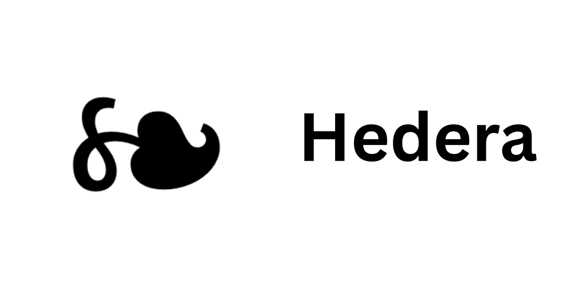
Also known as a fleuron or printers’ flower, the hedera is an element or glyph once used as a typographic element or embellishment, similar to the asterism. Hedera is also the genus name of the ivy plant, which the leaf-like symbol resembles, as hedera is also the Latin term for ivy. This stylistic element was also sometimes used to separate paragraphs in written documents or to indicate the indentation of a paragraph. Of course, it is tricky to draw an idealized ivy leaf and to do so quickly. As a result, the intended use of the hedera has largely been replaced by another mark: the pilcrow (¶), sometimes known as the paragraph mark. This mark is used both in proofreading to indicate the need for a new paragraph as well as a marker in many word document and page design programs to indicate a new paragraph or section of text.

Intended to combine the functions of the question mark and an the exclamation point, the interrobang may be the most famous of the unconventional and rarely used punctuation marks. Also known as the interabang, it is not available on standard keyboards and – outside of those who know its Unicode, is sometimes rendered in text variously as ?!, !?, ?!?, ?!!, !??, or !?!. The name for this punctuation mark came from an alternative name for the question mark – the interrogative point – and the printer’s jargon for exclamation point – bang. It was first proposed in 1962 by Mark K. Speckter, a New York-based advertiser and copywriter. While there was some early interest in its us in the 1960s and 1970s, it largely fell out of favor.
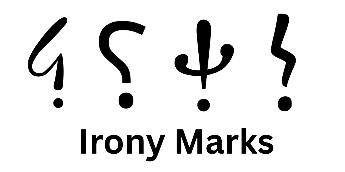
It is a common refrain to hear these days that there needs to be a special font that indicates sarcasm. This is not a new idea with several proposed irony marks – also known as irony punctuation or sarcasm punctuation – having been proposed over the years. In 1668, English author and clergyman John Wilkins suggested the use of an inverted exclamation mark. Belgian publisher Marcellin Jobard introduced the point d’ironie or “irony mark” shaped like an overised arrow head with a small steam in 1841. A similar mark was proposed by the French poet Alcanter de Braham in his 1899 book L'ostensoir des ironies to indicate both irony and sarcasm. This glyph is the first in the image above. Among the several new punctuation points suggested by the aforementioned Herve Bazin include the , modeled after the Greek ψ. In 2007, the Dutch Collectieve Propaganda van het Nederlandse Boek set forth the ironieteken, or the final mark in the image above. Of course, the second mark in the above image was proposed as a mark of sarcasm or irony only after it was not adopted for its original use. That was as the:
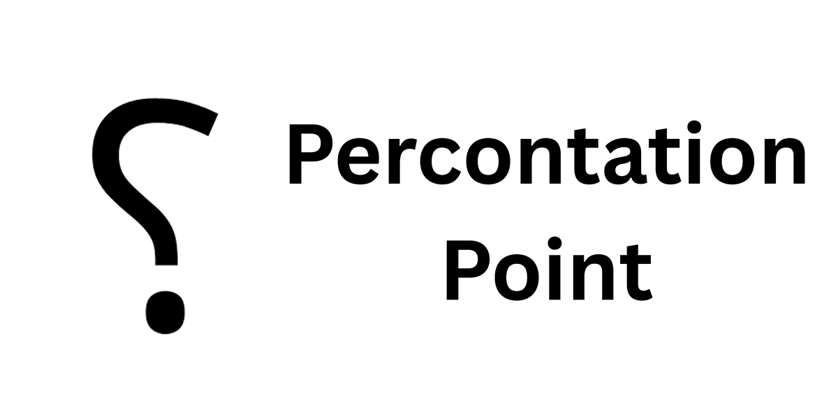
In the 1580s, English printer Henry Denham launched the trend of so-called irony marks with his invention of the percontation point, intended to be a special question mark used for the asking of rhetorical questions. The character is similar to the question marks sometimes used in Arabic, which is one of many languages read right to left rather than the left to right of most European languages. This mark may have descent from an earlier, defunct punctuation mark known as the “punctus interrogatives,” which was said to resemble a lighting flash design with the lighting striking from the right then going left. The original intention of this mark was said to distinguish between questions that required answers and those that did not. The percontation point was later revived as a potential symbol for use to indicate irony and sarcasm rather than rhetorical devices.
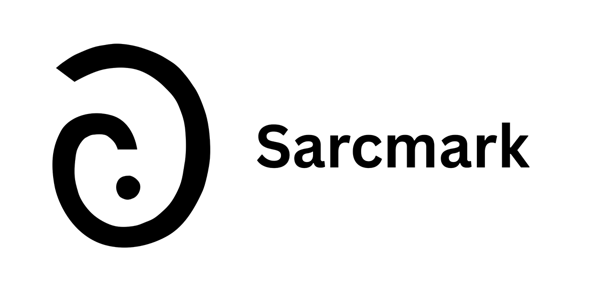
Another attempt at figuring out a way to convey sarcasm in text, the sarcasm mark or “SarcMark” was trademarked by Douglas Sak who created his own company in 2006 to promote the use of the mark to convey sarcasm. His website provides both instruction on how to use the mark as well as various downloads and plug-ins to apply it to every day conversation. Sak is far from the first to try and devise a way to indicate sarcasm in the written work, ranging from British journalist Tom Driberg’s suggestion that leftward slanted italics rather than right slanted ones should be used to the use of quotation marks to convey “scare quotes” or “air quotes” around particularly phrases said in sarcastic or mocking tones. It may be too early to tell if the will SarcMark take off.